
.png)
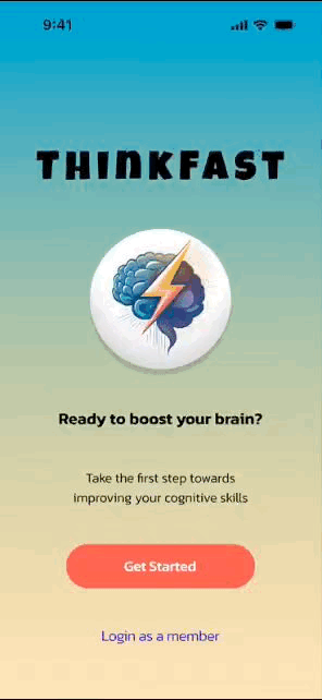
ThinkFast
Ready to boost your brain?

Case Study
My Team
Sara (me), Nuri, Thomas, Elvis, & Ford
My Role
UX Researcher, Lead UX Designer, and Interviewer


Project Overview:
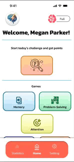
ThinkFast is designed to help users enhance their cognitive skills and comprehension through daily challenges. With a variety of engaging games, the app targets key cognitive functions, offering users the opportunity to learn from their mistakes and improve with each play. By focusing on both skill development and actionable feedback, ThinkFast keeps users’ minds sharp and continuously engaged.
User Research
Understanding the users P.O.V
01
Problem Statement:
Users often find themselves frequently turning to their phones during idle moments throughout the day, such as waiting for the train or their order at a cafe. While social media or traditional video games act as time-fillers, users express guilt and the feeling of “time wasted” when using these platforms.
02
Proto Persona & Initial Research:
We created a proto persona, Chris, an advertising strategist who spends idle moments browsing social media or playing games on his phone. After some use, Chris feels drained and tired. He needs a time-killing activity that leaves him feeling more energized. With this in mind, we aimed to design an app that offers an alternative to social media or traditional games.
03
User Interviews & Affinity Diagram:
We conducted user interviews and sorted the feedback into an affinity diagram with categories such as: "App Ideas," "Top Apps Users are Drawn to," "Learning Habits," "Anti-Social Media Sentiment," and "Challenges with Similar Learning Apps" (reflecting issues such as overly complicated games or limitations in free services). This analysis helped us better understand our users' daily app usage and openness to learning.

Affinity Diagram
04
I Like, I Wish, What If:
Users shared feedback on what they currently enjoy, what they wish for, and what we could improve. After dot voting, we decided to focus on creating an app that stimulates users' intelligence.


Definition & Synthesis
Empathy Map & User Persona:
Based on our research, we created an empathy map to understand what our users hear, see, say, and feel. Users wanted to learn new things, reduce time on social media, and find alternatives to traditional games, which were too complex or costly.
From this, our user persona, Megan Parker, emerged. Megan is tired of social media and seeks educational games that match her level but finds most apps boring. She needs an app that helps her learn without jumping through hoops or becoming monotonous.
Competitor Analysis:
With many educational app platforms on the market, my team and I decided to conduct a competitor analysis to learn from our competition. We conducted a direct competitor analysis of Elevate and Peak. Key insights included: Opportunities: Expand skill set, improve algorithms for skill-matched games, and enhance the freemium model to attract more users. Threats: Peak’s visual appeal and adaptive learning features, as well as Elevate’s strong brand, could hinder user retention for advanced users.
Our indirect competitor analysis was based on Wordly:
Opportunities: Leverage innovative approaches to meet broader market needs and enhance product advertisement to drive consumer interest. Threats: Wordly’s market position in adjacent markets targeting similar broader needs could impact our ability to capture certain user segments.


Ideation
Brainstorming & User Storyboard:
Using insights from our research, we brainstormed potential solutions. One user storyboard showed a persona discovering our app, "ThinkFast," on her way to work. After using it, she felt satisfied and continued engaging with the app regularly.
User Flow & Sketching:
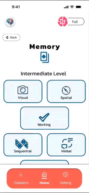
We created a user flow, mapping out the steps users would take: from opening the app, completing a level assessment quiz, playing a game, reviewing their progress, and seeing milestones. We then moved to low-fidelity sketches based on this flow.


Prototyping (Low-Hi)
Wireframes & Low-Fidelity Testing:
We used the sketches to create our lo-fi wireframes, matching the user flow. As well as we conducted usability tests. These tests helped us prioritize features and ensure alignment with our sitemap. Key insights included:
-
Users were unclear about the quiz's purpose. They suggested it could be placed more effectively and paired with a clearer explanation.
-
Progress and milestones should be separated by category.
-
Icons required better design for clearer functionality.


High-Fidelity Prototype & Style Guide:
After incorporating feedback, we created a high-fidelity prototype. We built a style guide to maintain consistency, focusing on elements like color palettes, typography, and buttons. Additional usability testing revealed areas for improvement:
-
The daily challenge feature didn’t stand out as unique and was perceived as just another memory game.
-
Users were confused by the placement of the re-take quiz option, leading to difficulty accessing it.
-
While users understood the page displayed their progress and strengths, they lacked insight into their mistakes and how to improve.


User Testing & Outcomes
High-Fidelity Prototype V2:
Version 2 results:
-
Home Page: Added a Mystery Daily Challenge that fits with the design.
-
User Stats: Created a layout where users can view their overall score and receive feedback for improvement.
-
Settings: Moved the retake quiz option under difficulty levels because the placement was more appropriate.


A/B Testing
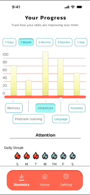
We conducted A/B tests for the Progress page and Game page to choose the most intuitive layout based on accessibility and user preference. The winning design not only aligned with our style guide and user expectations but also demonstrated strong accessibility by improving ease of navigation and readability for all users.
Test A:
Progress Page:
-
Simple, clean graph design.
-
Game category with a background color and game-type icon.
Game Page:
-
Removed the back button and added a smaller timer on the side.
Test B:
Progress Page:
-
The graph includes lines and numbers, allowing users to see their position on the scale.
-
Each game category has a plain background with the game-type icon in the corner of the box.
Game Page:
-
Added a back button for design consistency and a larger timer in the center to emphasize the importance of time.


Final Prototype


 |  |  |  |
|---|
Conclusion & Future Opportunities
Conclusion:
ThinkFast is designed to reduce doomscrolling while improving productivity and cognitive skills. It offers a fun, educational way to track progress and achieve personal goals instead of using social media.

Future Opportunities:
In the future, we plan to introduce a Progress Sharing Community! Users will be able to share their progress and tips, helping everyone grow together as a community.
.png)

Let's Get
Social
.png)